Overview
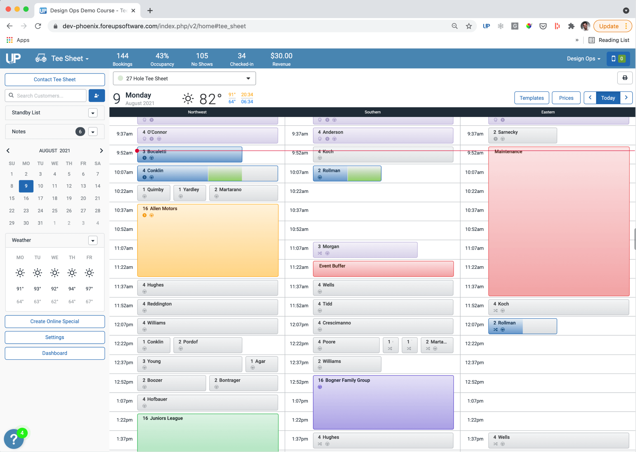
As our flagship product, ForeUP’s Tee Sheet is used by roughly 95% of our 1,500+ courses and clubs to manage their tee-time booking reservations.
ForeUp decided to place a heavier focus on allocating ongoing resources and efforts for the foreseeable future on their B2B Tee Sheet product, with the vision of being the best tee sheet in the golf industry.
My Role
Sr. Product Designer
Research, visual design, prototyping, and user testing.
2019 – Ongoing
Background
I joined ForeUP as a Senior Product Designer 3 years ago as one of two designers. I currently support our Tee Sheet product team, which is charged with the vision and ongoing effort of providing our customers with the best tee sheet in the industry. I am responsible for leading the UX and UI across all fronts of the Tee Sheet module, as well as our design system as part of a DesignOps team.
While with ForeUP, I’ve grown greatly with some key achievements listed below:
Implemented product and design processes
Improved product research and testing
Established a design system
Established a design kit
Process
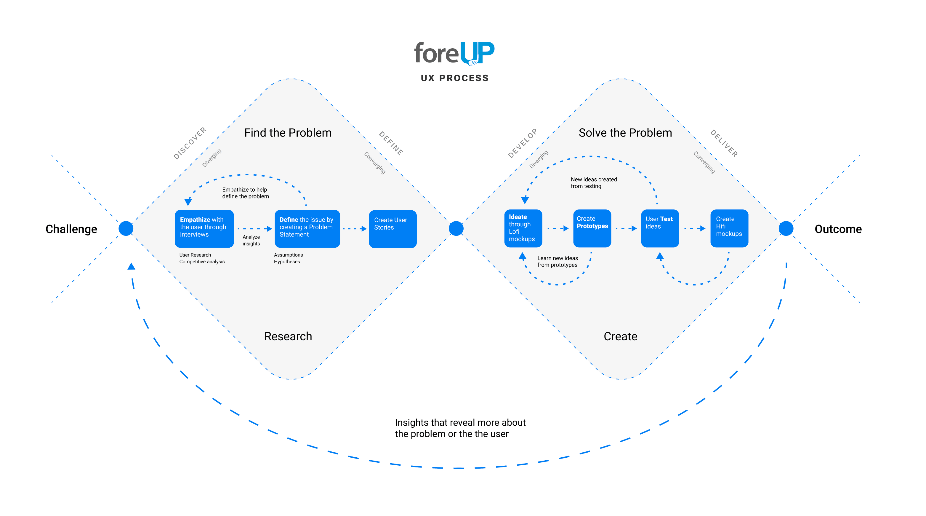
Our design process at foreUP is based on the Design Thinking framework. We aim to incorporate the key phases of Empathize, Define, Iterate, Prototype and Test as tools used within the Double Diamond approach.
Understanding the Problem
Empathize with our users
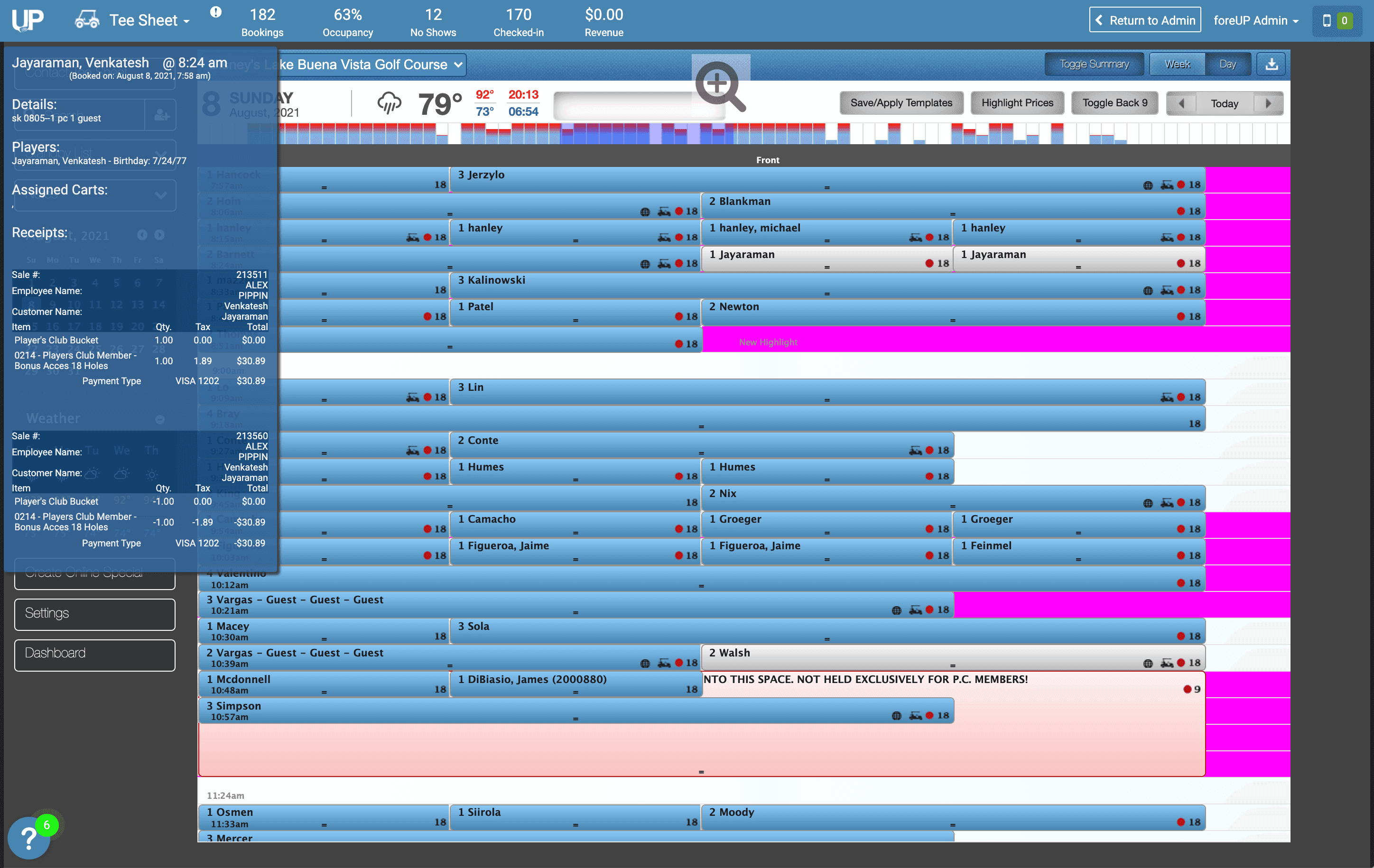
At the very start, ForeUP developed and released its Tee Sheet, out of a business necessity, and due to an extremely tight deadline, without any consideration to the user experience or usability in the course of a couple of weeks.
This method of development also led to a major technical issue. Over the years, developers have avoided work on the tee sheet due to its large amount of technical debt.
My research encompassed:
Understanding the user goals and needs
Prioritizing and planning out strategy to business and user needs
Uncovering pain points through user interviews and observations
Gathering Insights
We used existing feedback via UserVoice and Pendo data to drive further primary research as well as generative research through the use of user interviews and onsite observations for contextual feedback. We then used the feedback we received to generate a new survey, made available to our users within the software, asking participants to rate the importance of a set of needs based on our collective feedback.
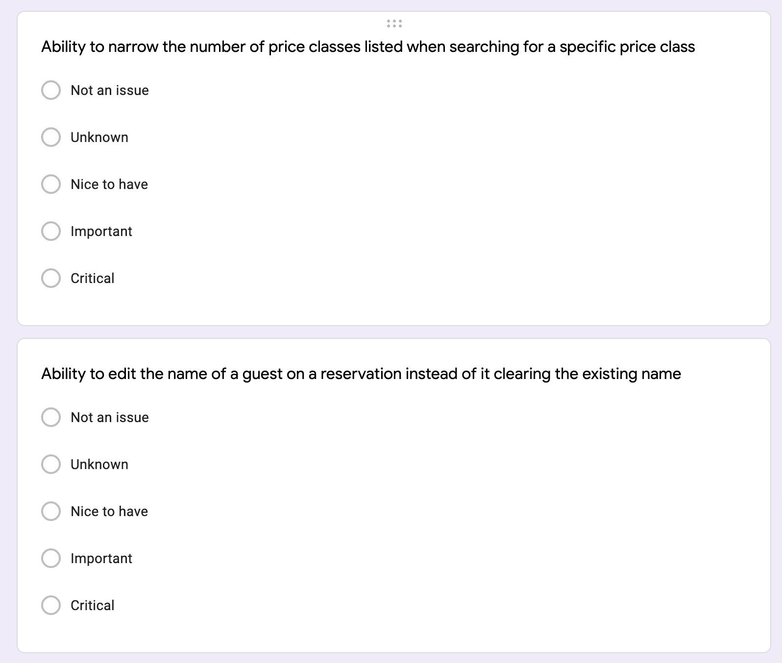
We collected and analyzed our data that we received and organized the feedback into larger data sets to develop relationships and themes.
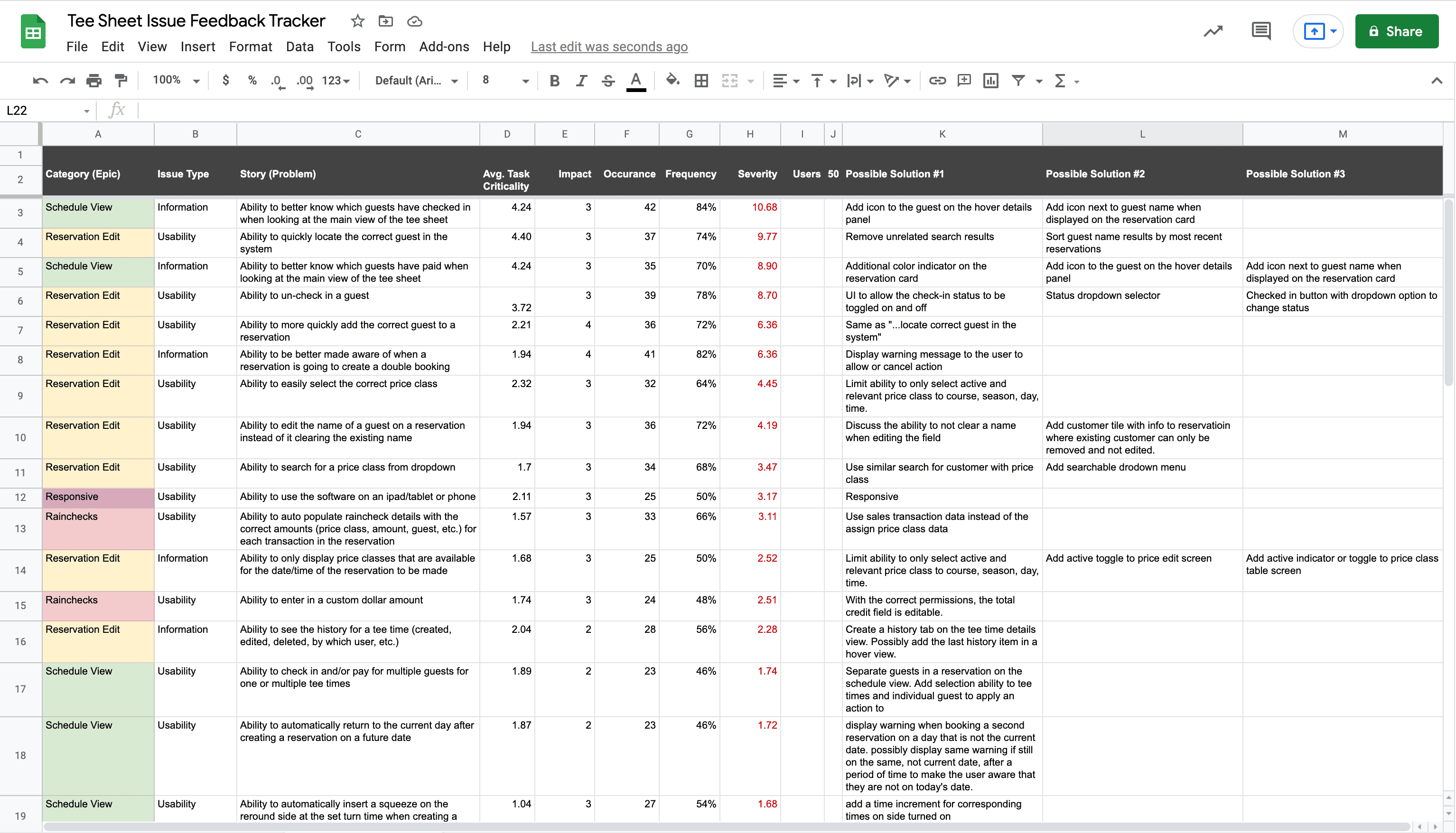
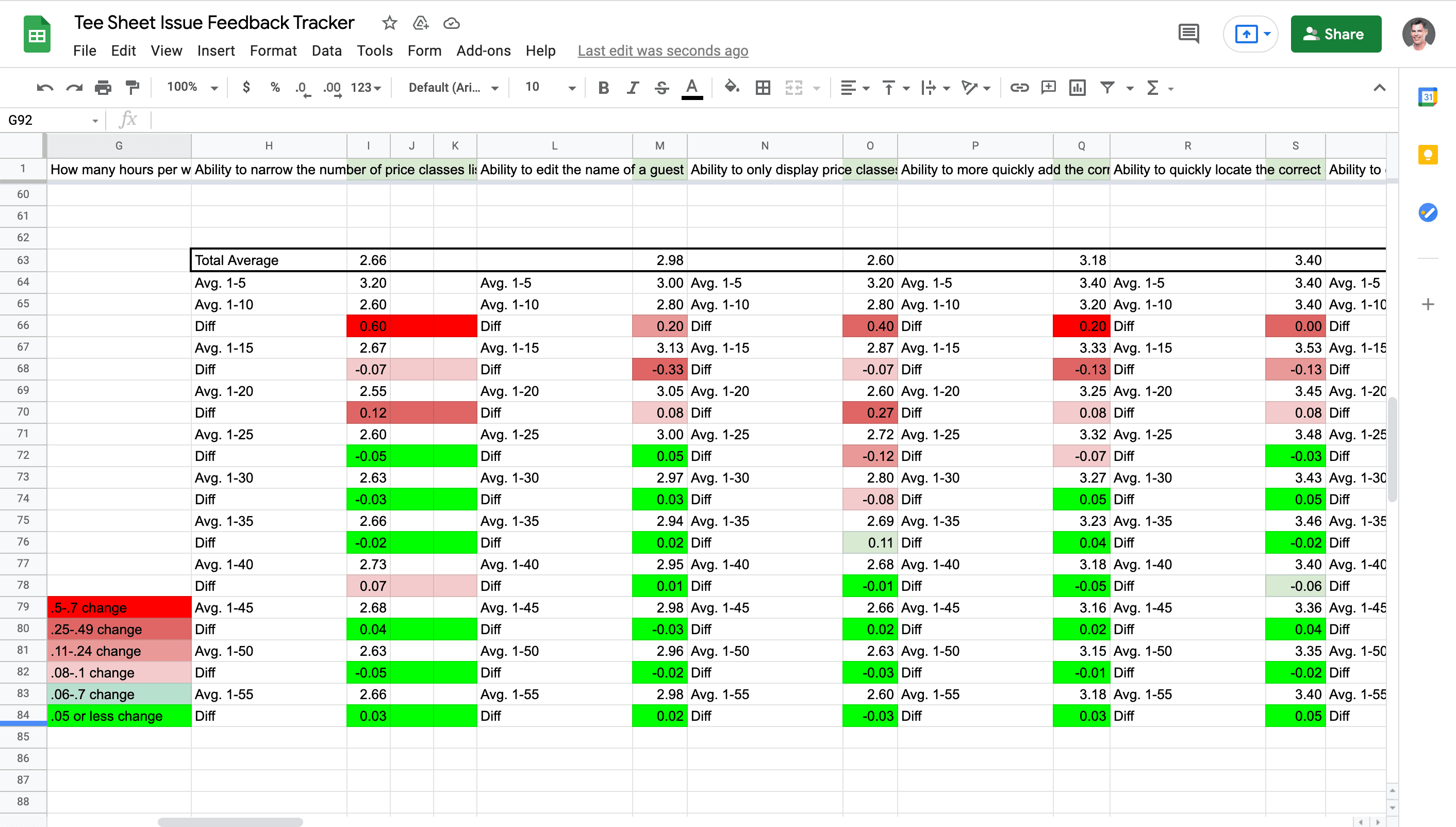
I used a data-driven approach by creating a severity rating system using the data from the feedback I received that could then be used to list out usability issues (stories) and their corresponding categories (epics).
Task Criticality x Impact x Frequency = Severity
Task criticality – how important is the need to the user? (1 = Not an issue, 5 = Critical)
Impact – How much of an impact does this issue have on the user’s task? (1 = Suggestion, 4 = Blocker)
Frequency (%) – How many times does this come up out of total participants?
Our feedback was brought into Productboard as insights, which were then attached to their corresponding stories and grouped into epics based on our affinity mapping earlier in the process. We can track criticality and frequency in Productboard by the number of insights attached to an issue, the importance score on an insight and a cumulative importance score for each issue.
Gathering Enough Research
We tracked the deviation of our feedback we were receiving. Once we began to see our importance scoring deviate at 5% or less, we felt confident in how to begin to prioritize the issues we needed to solve.
Prioritizing Issues
We categorized the problems into stories and epics to provide the product team with an understanding into the key issue areas of the tee sheet that needed to be addressed from a usability standpoint. This, along with input from our development team on the effort needed to build out the possible solutions, helped us to prioritize usability issues in order of need as well as help us potentially shape the product roadmap.
Our product team came to the conclusion that the first epic to prioritize would be to have a better understanding of reservations and guests that are paid vs. checked in on the schedule view and reservations edit modal due to its severity score and development effort required to rebuild it.
Narrowing the Scope of Work
Based on user interviews and survey feedback from our 50 participants, we identified some key issues where we could begin to make a significant impact on usability.
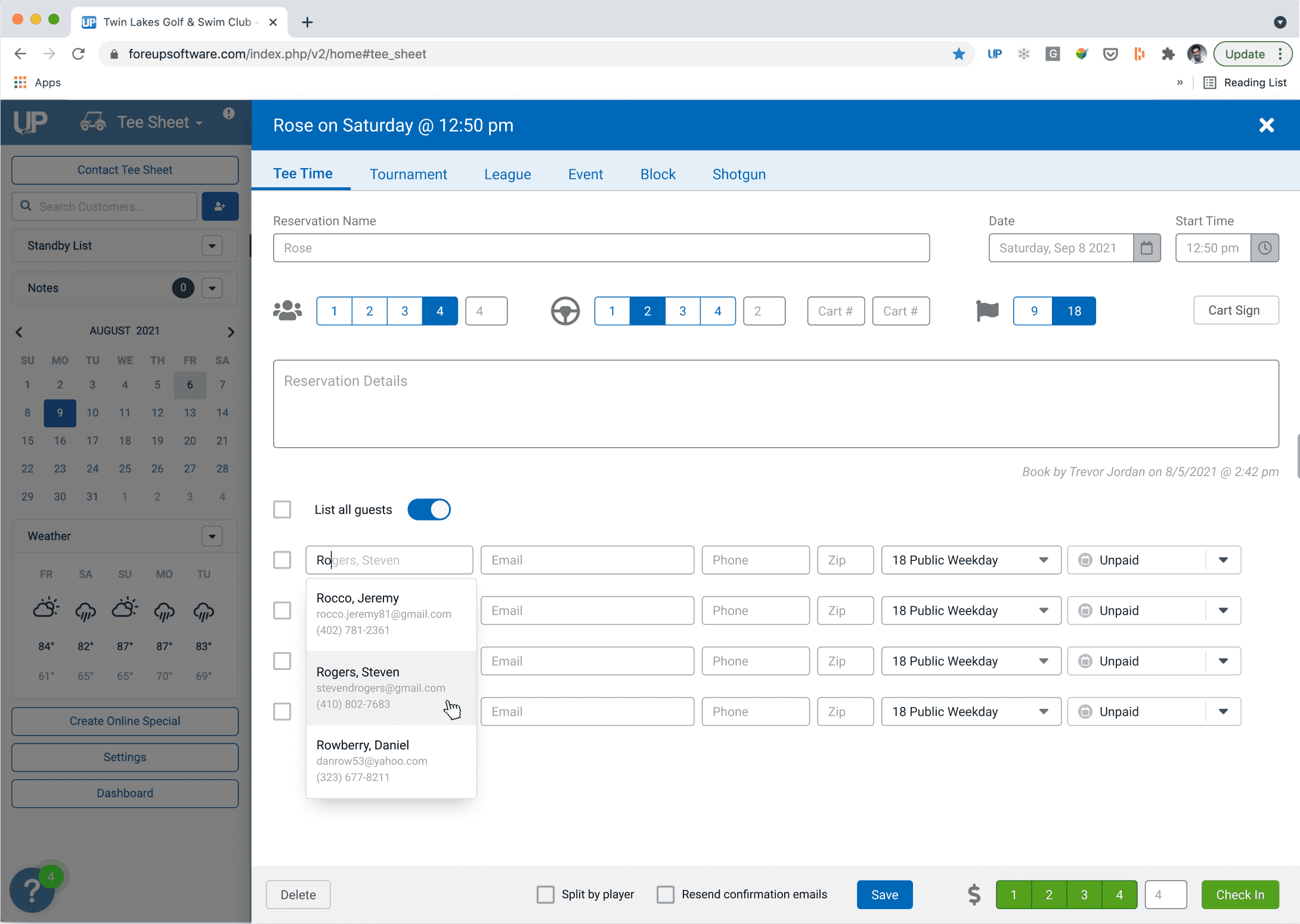
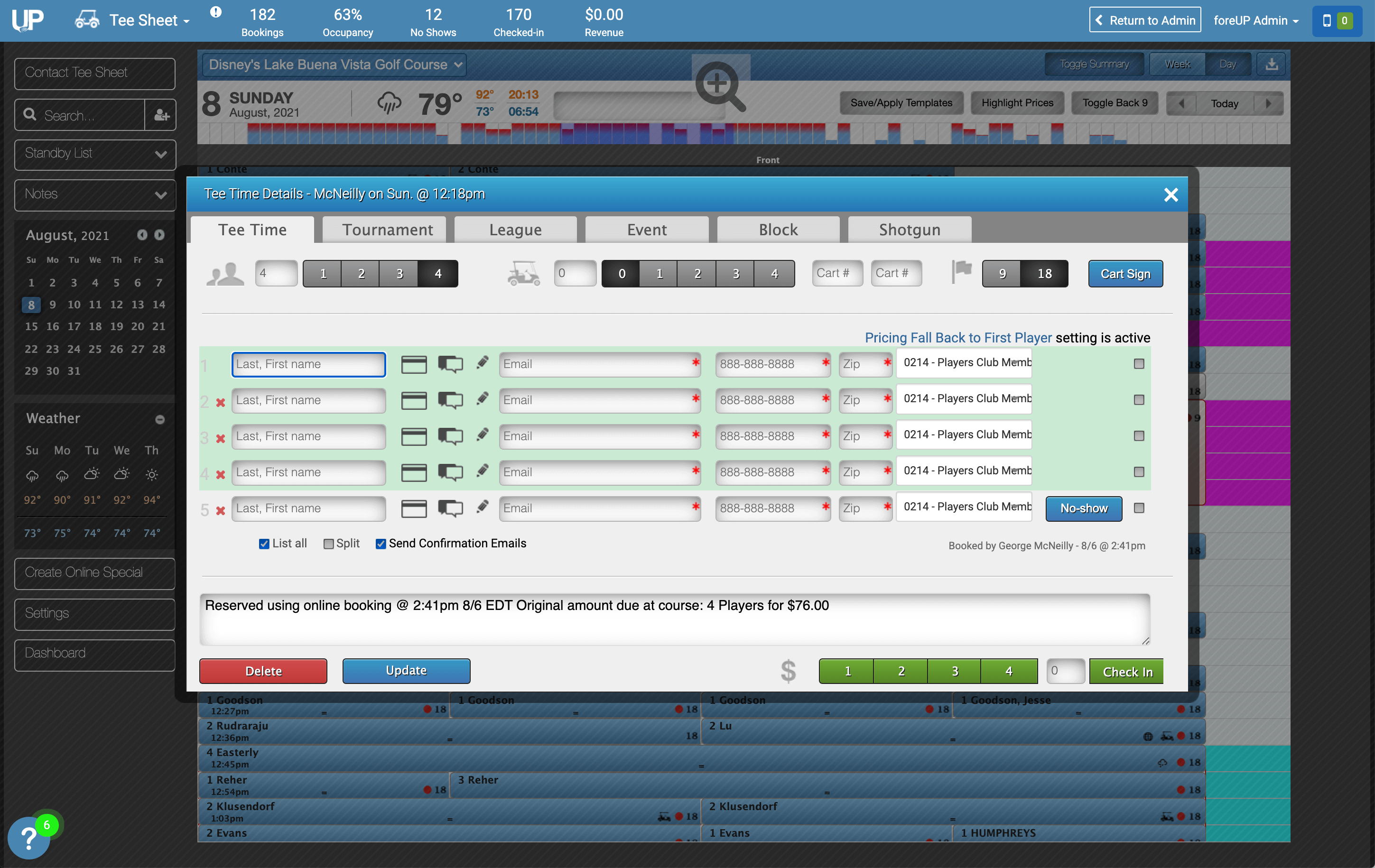
100% of users found some sort of issue while interacting with the reservation modal screen when creating and/or editing reservations.
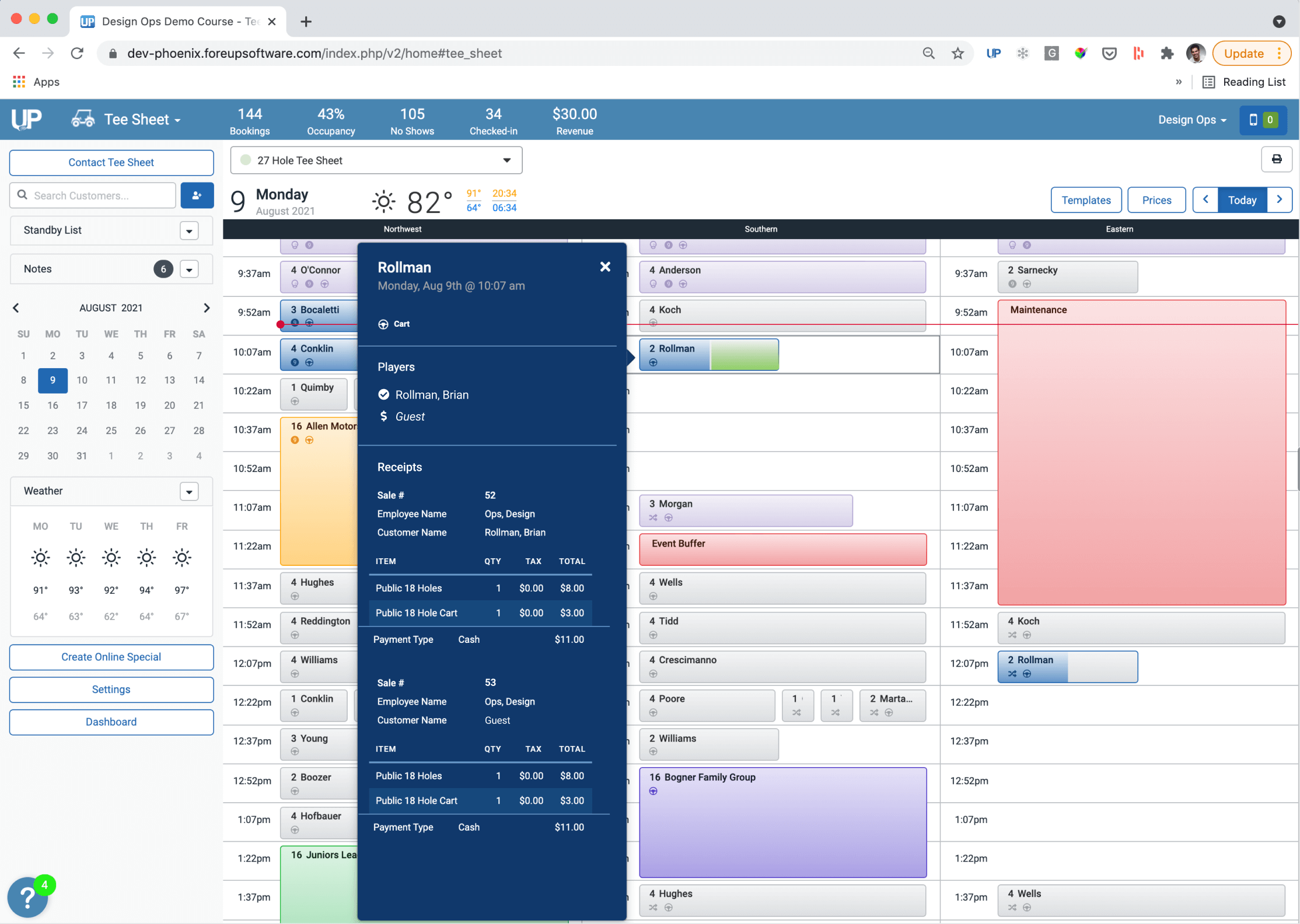
84% of user find it difficult to distinguish and identify which guests have paid vs. which have checked in
78% of users have experienced an issue where they need to revert of undo checking in a guest.
Wireframing the Solution
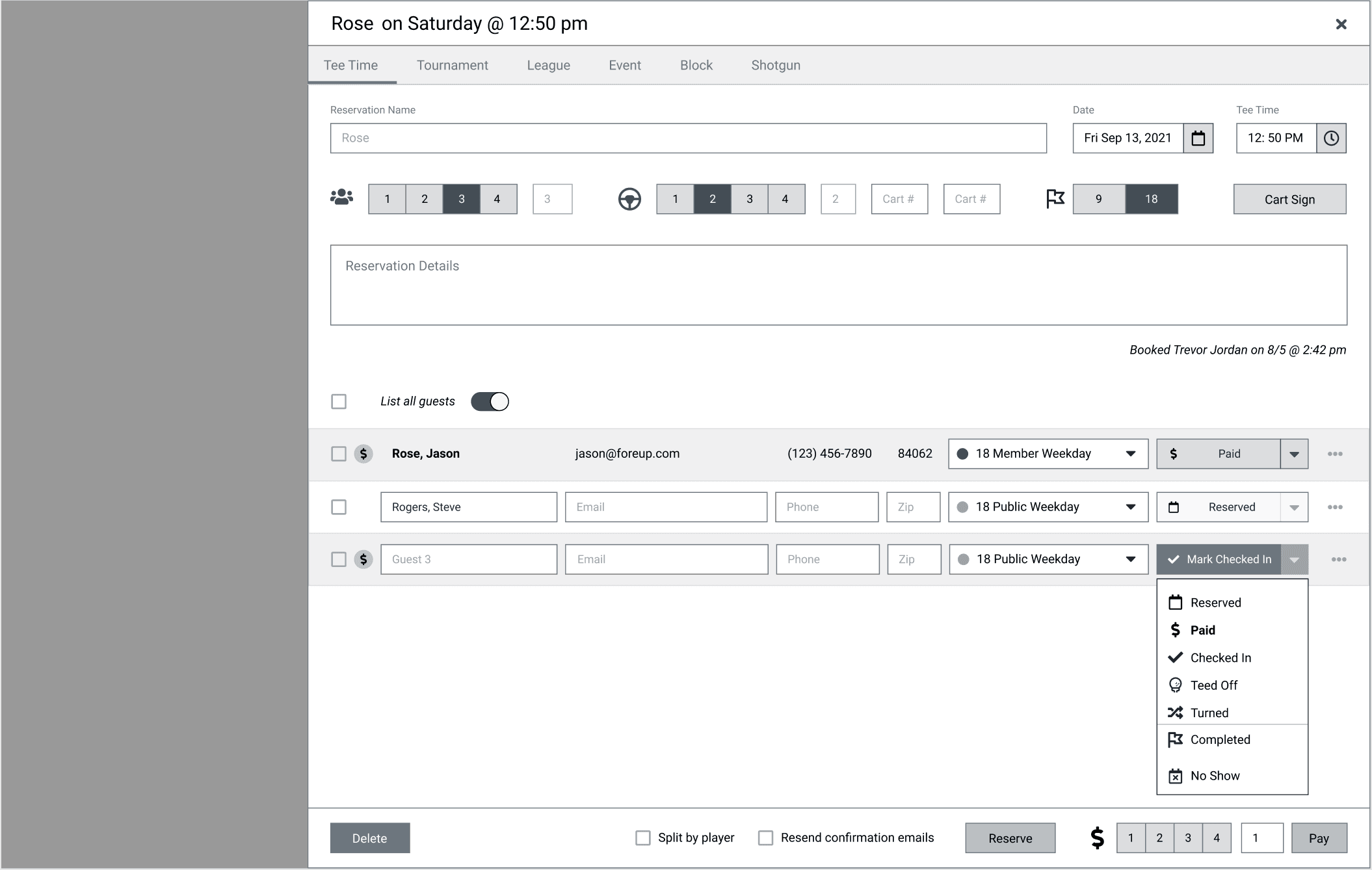
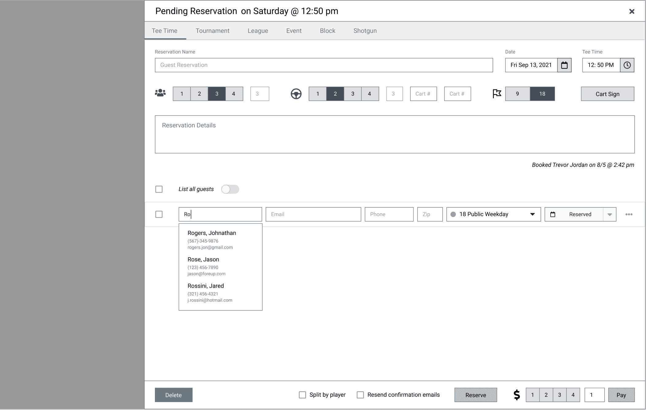
Based on the key issues we identified, I worked towards addressing the issues by wireframing potential solutions for the following:
Establishing a clearer indicator as to when a guest has paid vs checked in
Reduce the confusion as to when and where guest details are editable within a reservation
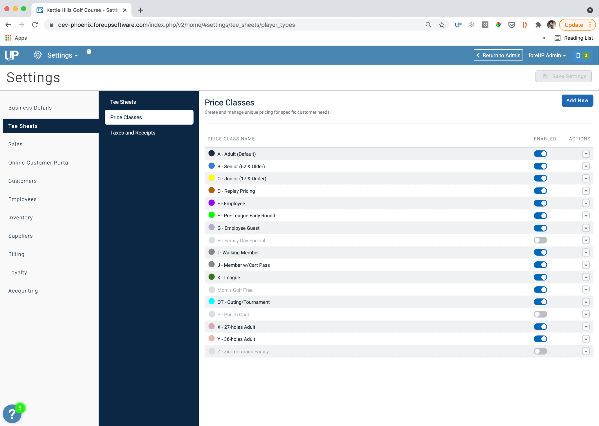
Increase effectiveness and accuracy when adding the correct price class to a reservation
I mocked up some wireframes solutions to gather feedback from our product team team as well as an initial small set of users.


Validating Designs
I conducted usability testing with our users to gauge how the initial iterations would solve our key issues. I tasked our users with the job to edit an existing reservation, check in a guest, change a guest from paid to checked in, as well as adding another guest to the reservation. I then asked the user to identify how many guests had paid, but have not checked and how many guest had checked in on a different reservation
During testing sessions, I observed the users to see how they interacted with the prototypes, how they created and edited a reservation. It was easier for the user to locate guests, assign the needed price class as well as identifying when guest information was editable and whether the guest was checked in or had just paid. The added ability of being able to uncheck in a guest and modify the status of a guest was a delightful feature to have. Although a slight increase in size of the the reservations on the schedule view seemed to be an issue with some users not being able to see as many reservations on the screen at once, the ability to distinguish between paid and checked in guests was a much welcomed enhancement.
