

In 2015, Centeva saw a need outside of their traditional line of applications with OX Sports — A total team management and communication platform for Football programs. This is the story of how I and the rest of my team championed our customers to give them the redesigned OX Sports they wanted and needed.
My Role
I was part of small product design team and responsible for the UX/UI work, overall visual design, branding, including product and marketing collateral between September 2016 and April 2018. I was also the primary driving force for the much needed visual and user experience overhaul in OX Sports 2.0.
App Redesign
Initially, our team had been tasked with the completion OX Sports (1.0) and it’s full line of features laid out by the previous set of designers. There had been quite a significant investment in a product that was a departure from the company’s staple line of Government Acquisition products. Stakeholders felt strongly about this product personally, and had received positive feedback on the concept based on some initial feedback and our small, newly hired team was ready to bring it to our customers.
As we began, it was apparent that designs had been put in place and developed that were troubling to us, along with its fair share of bugs. The application was a complex one, with an abundant set of interweaving functionality. As a fresh set of eyes and emotion, I analyzed the landscape of the existing iteration, it’s set of features, how the data worked togethers, while most importantly taking note of my experience using it.
We did our best and made a significant progress and improvements cleaning up the UI, while still keeping its existing feel, as to move forward towards our Stakeholders sprint, and release deadlines. As I began meeting with and interviewing our customers, it was apparent that they did in fact like the concept, but were struggling with the experience and how to use the app.
Our team continued to meet with our customers as we moved through designing the set of existing, along with new, features that came down the pipe. Data and feedback on the current iteration of OX Sports was presented over time as we looked to convey the need to step re-examine the application, and it’s set of features and it’s overall user experience.
After the appearance at our first coaches conference, and the acquisition of our new business analysts present there, the feedback presented itself confirming that coaches wanted to get OX Sports in their hands, but it was indeed time to re-examination the application if we wanted to position ourselves amongst our competitors. OX Sports was what our customers wanted, and needed. Although, once in their hands it was clear that it was definitely in need of an experience overhaul.
Let's Play Ball!
With another series of coaches conventions around the corner in the coming months and the upcoming football season ahead of us, our team was tasked with two primary responsibilities–to enhance the app functionality by adding newly required features and deliver an overall experience that would tackle our competitors in a desktop, tablet and mobile platforms within 4 months. The combination of a fixed deadline, app store submission time, and usability testing meant I needed to get the experience right away.
Our primary objective — to provide a powerful, one-stop team management solution that allows all key personnel and players within your organization to quickly analyze, manage, and interact making your program more efficient and therefore, poised to win.
The Approach
Focusing on Goals
A feature-filled application that surpassed our competition was definitely a topic of priority for our stakeholders, but as a team, we felt it was not in the best interest of the application.
We needed to understand what tasks our customers were looking to accomplish, how they performed them, and how we were going to meet their needs, all in a more meaningful way.
Most of the team, including myself experienced a lack of domain knowledge in the football arena. This meant not only learning about the current application but also learning the ins and outs of the game in order to properly meet the user’s need and reach our goals.

Timeframe
Due to the timeline of the project and the need to also freshen up the UI, we decided to hit the ground running and use Angular Material. This allowed our team to maximize and optimized the short period of time we had.
Consistency Across Design
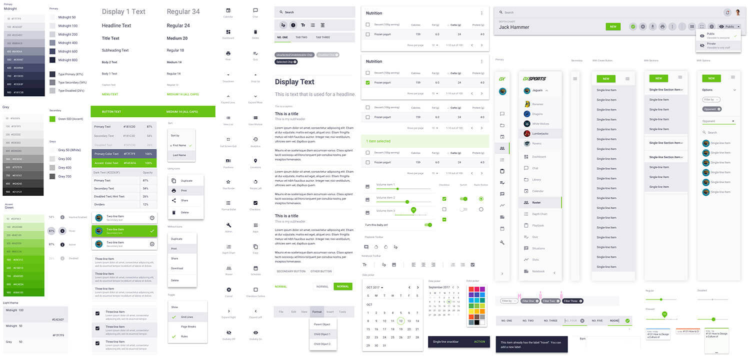
We wanted to create a unique and beautiful design system, but we also knew that our time was limited and collaboration and keeping everybody on same page with so many features, and so little time, was imperative. Using Material Design allowed us jump from wireframing to UI almost instantaneously with a consistent look between all of our designers. The use of symbols and design libraries allowed us to be able to easily enhance our design system across all designers and projects files through to the development team.
Standardize
With an already existing design framework and codebase in place, and our development team located in Belarus, using Angular Material kept things fast and consistent.
Design for what will be built
In an effort to make sure that our hours of designing saw the light of day, we implemented the 40/40/20 method where the first 40 are ‘must haves”, the second 40 being “nice to haves”, and the remaining 20 leaving room for “innovation”. This allowed us to focus on the now while still looking at the road ahead, which kept us from wasting time on things that won’t ever be built or left on the development room floor.
The Discovery
What does OX Sports mean to you?
We wanted to make sure that we understood what was going to be possible and what we could accomplish. Our initial discovery phase was quick, with a large effort to define projects milestones, take inventory of the applications existing state, review what our competitors looked like, and what our customer’s pain points, how they worked, and what was important to them.
With our team of business analysts that shared the knowledge, mindset, and experience as customers, along with our initial research, we quickly came to understand who are customers were and where we felt our efforts needed to be focused for our initial 40.
Our research revealed that the concept of ‘OX Sports’ represented something different to users of the scheme. Users’ motivations for riding and participating in the scheme differed, hinting at different requirements.
I immediately set out scheduled visits to conduct interviews with some of our customers, primarily college and high school coaches, using the existing iteration OX Sports. It was clear and consistent that our users were overwhelmed with a feature-rich application that was requiring more time to use than they had available to allocate, didn’t quite match their existing workflow, and most of the time just had a difficult time understanding how to use it.
The Vision
Total Team Management
Throughout our research, we heard over and over again that coaches were frustrated with the amount of paperwork and variety of programs they needed in order to perform their roles. The ultimate vision for OX Sports 2.0, then, was to to be a one-stop shop, the ‘swiss army knife’ of team management applications, saving the coach from the seemingly endless task of jumping from application to application, and providing more time on the field in front of his team.
Remove Redundancies
Design the app where every tool talks to one another in intelligent ways so that as many tasks as possible only needed to be performed once.
Consistent User Flow
Keep common UX patterns consistent throughout, eliminating the time it takes to learn the app so more time can be put into teaching on the field.
Something for Everyone
Create a clean, meaningful space for the coaching staff, athletes and fans, each with their experiences tailored to their individual needs.
The Framework
Setting the Direction
We took a top‐down approach to identifying the overall structure of the experience. I white-boarded and sketched out ideas of various structures and arrangements of the UI, what the process and user flow might look like, constantly considering things like, who the user would be, evaluating for consistent UX patterns, asking myself if the experience would familiar to them, is it intuitive, and so on. We began with broad strokes and concepts, with the application coming to life as the components, patterns and screens were pieced together.
Structure
Our customers consisted of both coaches and players – Each on both ends of the age and technology usage spectrums. We wanted to deliver an experience that they both felt familiar and comfortable with. Our customers current tools and experiences ranged from clipboards, notebooks, and printed to Google products, instagram, facebook and so on. We set out seeking commonalities between our customer’s existing experiences to combine how they worked and what they knew.

Wireframes
Knowing that a variety of tools important to potential clients and stakeholders were to be included at launch, we mapped out the major features of each component on several whiteboards. As similarities between them took shape, so did our ability to create sketches and rough wireframes. Some of these ideas ended up on the cutting floor as we found either the UX pattern too inconsistent, or not fitting into our ultimate vision.

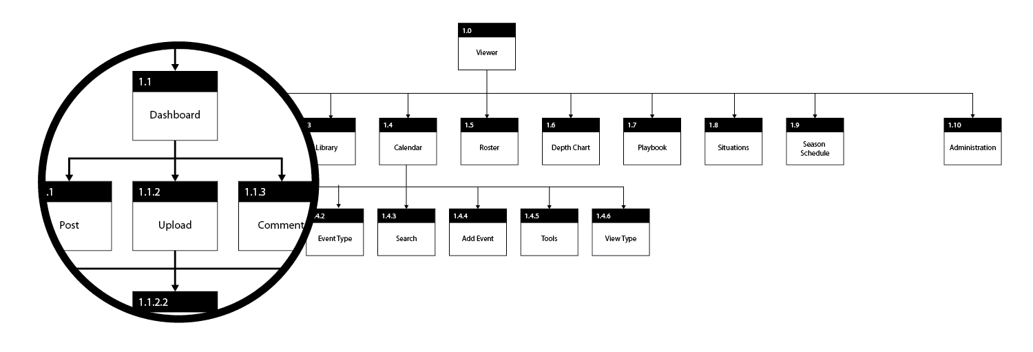
Information Architecture
Throughout these early stages, regular conversations were being held with the development team overseas. Although they were already familiar with the application given their experience on the first version, the redesign to version 2.0 was a completely new challenge. We anticipated that the application (and the architecture it would be built on) needed to support a user base in the tens of thousands. With so much communication, media sharing and interaction taking place, the app needed to maintain stable and snappy performance.

User Flows
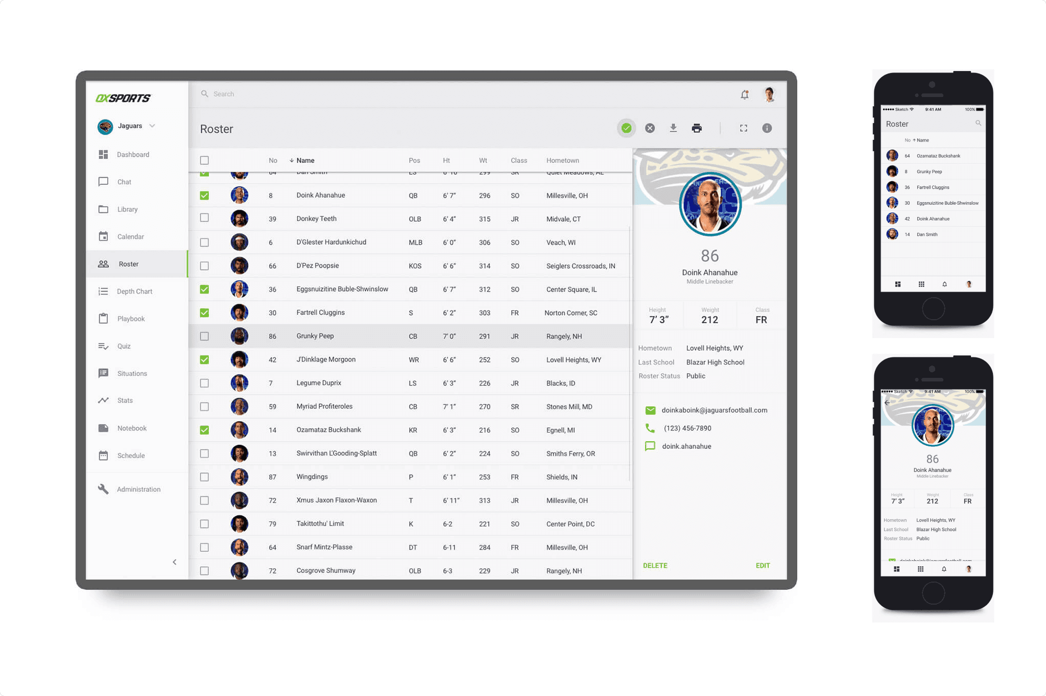
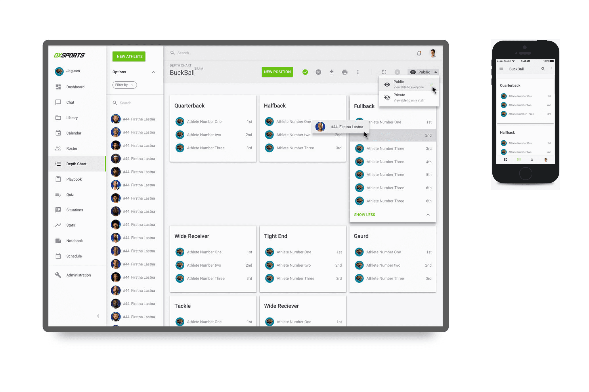
A great deal of time was spent mapping how the user performed their day-to-day tasks. Some tasks, by virtue of having an all-in-one application, would be new to the user. These needed to be minimal and ideally performed only once during the onboarding phase. The bulk of their interaction, however, was designed to be nearly identical to their current work flows. A shareable Roster that could be quickly manipulated to reflect active players from week to week, the ability to create Playbooks from existing PDF or Powerpoint presentations, and Depth Charts made to mimic a whiteboard full of names on post-it notes, easily moved around from one position to another.
Design System
We wanted the visual experience of OX Sports’ UI to be elegant, but time wasn’t on our side. Building a complete visual language full of components, interactions and other elements at an atomic level would not be feasible. Being charged with overseeing the design system, I advised the team that we look to leverage Material Design out of the gates to perform the heavy lifting, allowing us to customization through typography, colors, shapes, and interactions, while working to budget in time to further customize components prior to our launch. Once the application was launched and running smoothly, we would look to schedule time to enhance the UI further.
Prototyping
During each major phase of design, wireframes, low- and hi-fidelity mockups were shared with stakeholders, product managers and (whenever possible) real-world users. Paired with Invision prototyping, designs and user flow were tested and combed through, providing a collection of invaluable feedback. While we were always happy to hear the positives, the negatives were just as comforting because we knew it gave us opportunities to retool, refine and retest. Sooner or later, solutions to each problem we encountered would be found and the application would be the stronger for it.

The Impact
WHAT CUSTOMERS ARE SAYING
“It was also nice to be able to say, ‘this is who you’re playing, this is their alignment to study’. It was nice to be able to pull out their tablet or smartphone, and have all of this information right there. I would recommend OX Sports to any program who’s looking to communicate effectively to their players.”
– Coach Rafe Maughan
“What I liked about OX Sports was that I had my game plan and everything I needed to study up on their wide receivers and offense, and all the things that I needed to call on our defense, just right in my pocket.”
– #19 Jaylyn Rapp
“We used it every single week of the season. It’s not a one-trick pony. Building recruiting databases, and being able to keep track of positions and classes…the fact that you have the scouting report feature, the scheduling feature…all these things combined are now within just a couple of clicks, you’re not having to move around to different programs to pull up files, it’s all in one system, and it’s fantastic.”–
Coach Zac Connors